Links of research of Miu Miu
http://07277494d.blogspot.com/
http://07218553d.blogspot.com/
Thursday 27 November 2008
REPORT
The reason for choosing Miu Miu as my brand of studying is her fascinating and arousing colors.
For the group research, year 2000 to 2009 Miu Miu collection is analyzed in detail. But for the 19th century, we could just find out some graphic advertisements, so the research is based on those promotions.
The core color of Miu Miu is changed gradually when comparing the 10 years color families. It can be divided into three periods: From monochromatic scheme to complementary color combination.
For 2000 to 2003, monochromatic scheme is widely applied. (For examples, dark brown, medium brown and light brown plus achromatic scheme: black, white and gray in year 2000 and 2001). Those colors are mainly low value and intensity, therefore, little color contrast is resulted. Monochromatic colors are always harmonious, so it is easy to carry and can widely accepted by publics.
Something changed in 2001. Miu Miu tried to add a variety of bright colors such as peacock green, dark red, orange, dark blue. However, it seems that the contrasting color combination can hardly accept by the customers. So, in 2002 spring collection, achromatic colors came back. Miu Miu tried testing complementary colors again in 2003, she used contrasting colors again. In these three years, not only the new color combinations are in transition but also the design, such that the style of collection is coherence.
Form 2004 till now, high intensity colors with various values is widely used, for examples dark red match with light green and purple. For 2004 to 2006, the collections are inspirited by the 50s to 60s fashion. Cream colors match with bright color of same hue are firstly invented. The color variation is much greater than before. I think from 2006 onwards, the color system of Miu Miu has reached a mature stage, the consistently use of complementary and analogous colors can prove that. And most of the time, proportion of colors is constant, meaning that she is not choosing one or two colors to outstand.
To sum up the past 10 years, the core colors of Miu Miu are monochromatic colors (especially black ,white , light brown) and contrasting colors(bright orange, purple, green, red and blue).
Based on the color system of Miu Miu, the forecasted color family is created finally. Double complementary colors with various values are applied. The color family I chose are mainly high value and high intensity. Different combination is used in the six outfits, for examples, I used complementary red and light green plus adjacent colors red and yellow. I tried to apply the principle of Novelty in order to match the color with the young and playful idea of Miu Miu collections, so, unusual color combination is used. I Hope the overall impression will be fresh and energetic.
After deeply analyzing the collection created by Miu Miu, I think she is brave to use color. That is why she said she used ‘ugly colors’ (Meaning that the colors she dislike). Taking risks is also brave. Blinded to follow the main stream of colors is definitely not her style.
Wednesday 26 November 2008
FINAL COLLECTION

 >>CLICK PLZ!
Color theories: double complementary colors (various value)
Colors: Mainly high value and intensity
1st. Analogous color combination (red + dark & light purple)
2nd. Complementary colors (red + light green), Adjacent colors (red + brownish yellow)
3rd. Monochromatic (dark & light green-blue ) & Complementary sleeve (orange)
4th. Complementary (dark purple + brownish yellow) , Adjacent colors (red + purple)
5th. Analogous colors (blue + dark & light violet-red)
6th. Complementary ((red + dark & light green), Adjacent colors (red + brownish yellow)
>> Principle of Novelty: In order to match the color with the young and playful idea of Miu Miu collections, unusual color combination is applied. Hoping that the overall impression is fresh and energetic.
Sunday 23 November 2008
Concert of Anthony Wong X Joey
 good show! :)
Design of lighting is the crucial part for stage!
Using cool colors to bring out the sad mood of the song.
 song: 貪生怕死 << the song I like most last night
Warm colors to stirred up a lot of excitement.
 song: 忘憂草
 song: 與蝶同眠
Tuesday 18 November 2008


Sunday 16 November 2008
FW Collection year 2010 Forecasting

The style of the fall winter 2010 collection is consistent with the previous collection of Miu Miu.
The idea is young and playful. Colors will be added later (which match with the concept) to find out how colors give energy and add playfulness to the collection.

Friday 14 November 2008
Film: Vicky Cristina Barcelona


Love, lust and intrigue against the sun-drenched backdrop of Barcelona.
Woody Allen uses narration to move the pace along pretty quickly and keep us attentive. It totally works. The film is a delightful basket full of wine, Spanish guitar,laziness, craziness, profound purpose and sexual intrigue.
I am a fan of Woody Allen and I think that his storytelling is so beautifully intricate and seamless. He has produced some of the most humorous scenarios and witty dialogues I have seen on the big screen.
What really impressed me about this film was ART!
The way Allen uses art in this film is masterful. It's not just about the painting, photography, music or writing, but also the way he captures the feelings and thoughts of the artists/characters.
AND, i found my DREAM HOUSE and lifestyle in the film!
Oh, for sure the color scheme of nature colors contributes a lot to the relaxing mood. It's eye pleasing and comfort.

Thursday 13 November 2008
Make up in different countries
Japan: monochromatic


High value color + Achromatic : Strong contrast


High value color + Achromatic : Strong contrast


A color chart for japan

>>Japanese always used pastel colors from the above color chat
Europe
Complementary color combination: (blue and golden-yellow)


Dramatic contrasting colors: (dak red & green)


Europe
Complementary color combination: (blue and golden-yellow)


Dramatic contrasting colors: (dak red & green)


Analogous colors


A color chart for Europe


>>They use lower intensity/satuaration of colors (dull & grayish) compared with japanese
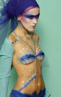
BODY ART -cultural differences


>>body art X different cultures
>>the idea & the preformance is amazing!
>>Monochronmatic & Complementary color schemes are applied
>>SKIN COLOR is merged with images
LOVE PSYCHEDELICO-Aha

LOVE PSYCHEDELICO is hit in Japan!
And i think the color used in the MV is appealing.
> reflects japanese culture
> low chroma + little bit bright color highlight
Research: Cultural differences
INDIAN FASHION


>>colors: complementary of high value colors
>>they accept bright and loud color combination
> which make their skin color look brighter and outstand themselves
BRITON 


>>colors: complementary of high value colors
>>they accept bright and loud color combination
> which make their skin color look brighter and outstand themselves
BRITON

>> Analogous color combination e.g. red & purple + Achromatic scheme
>> create focal point and sequence of order
> More subtle
> I like their style: look chic and smark but not too loud
JAPANESE
The case in japan is really extreme. They have several wearing styles, so I singled out some styles of interesting color combination to analyze.

>> Some like Monochromatic color/Achromatic + bright color accessories

>>they are also influence by music elements e.g.rock
> bright color + bright color = sharp?
Wednesday 12 November 2008

Tuesday 11 November 2008
Coloring home interiors

This book is about interior-design projects.
Photos plus sketches & ideas and inspiration for architects & designers.


COLOR is the cheapest and most effective way to improve a space, isn't it?


Aqua HK


>>Again, color affecting mood!
another useful book
 Pilar Chueca (lives in Barcelona.)
Bubbling with life, sound, and color, here are the most superb shops from around the globe.
Pilar Chueca is the editor of the Architecture in Detail series and the author of many other publications on architecture and interior design.
Subscribe to:
Posts (Atom)
